

brand repositioning – creating cohesion
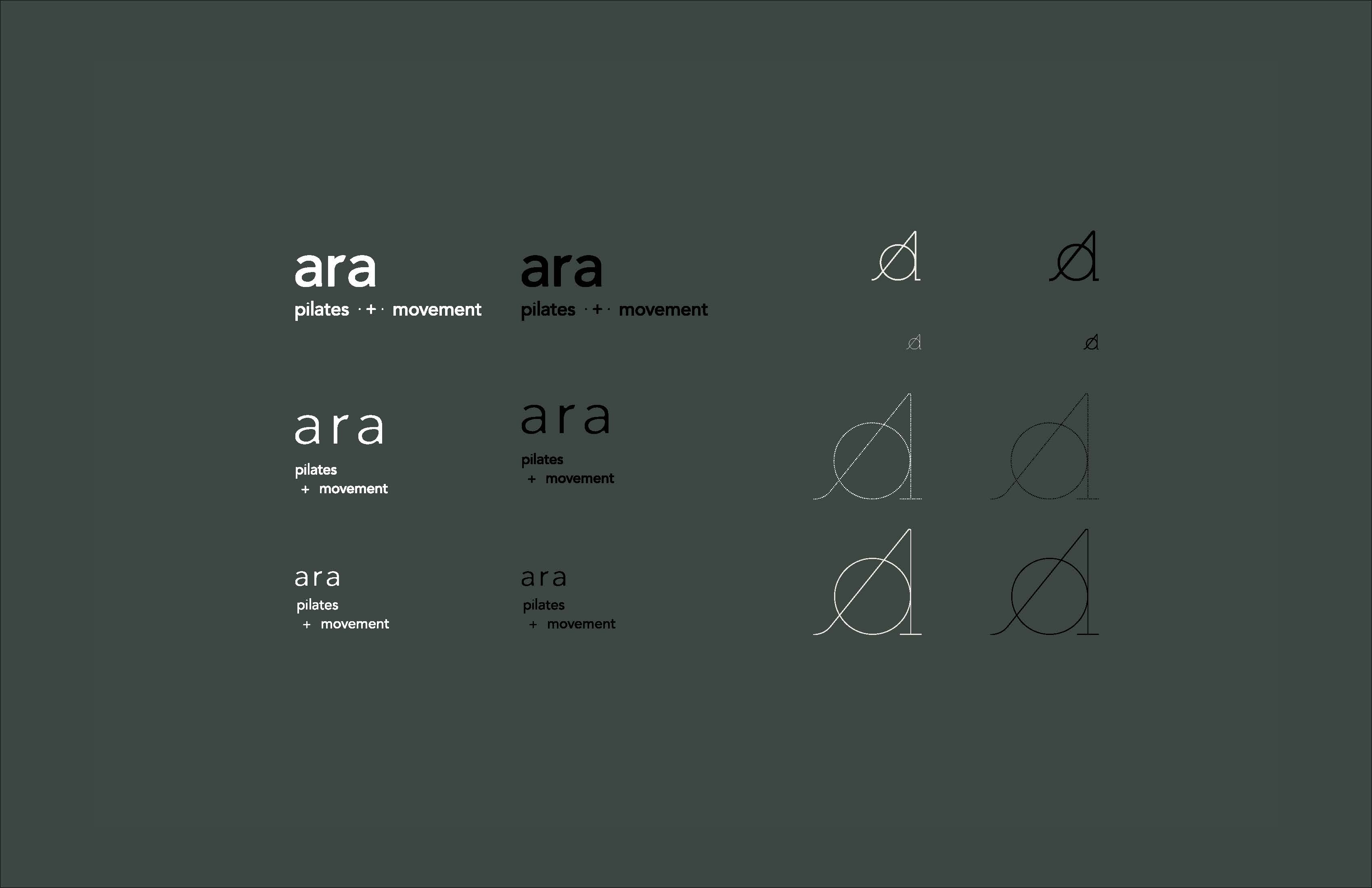
Ara is a Latin word meaning “altar,” and the name of a constellation in the southern sky. For the Indio, CA pilates studio, the name means a place to return to, show up, and practice.
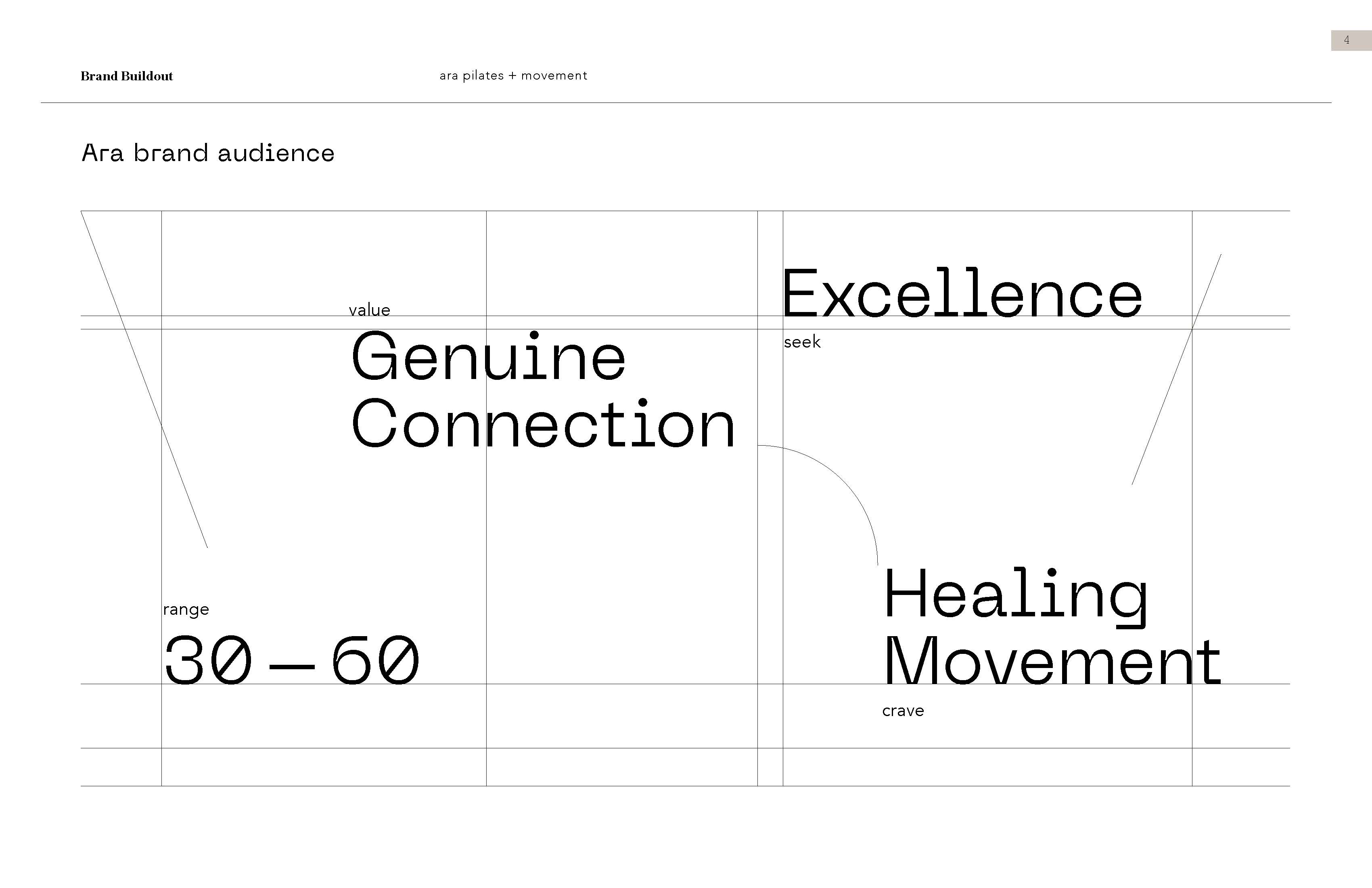
Marlys came to Wide Eyed Studio to rebrand and reposition her studio. She wanted a brand that felt unique in the pilates world while welcoming new clients to her friendly, approachable teaching method.
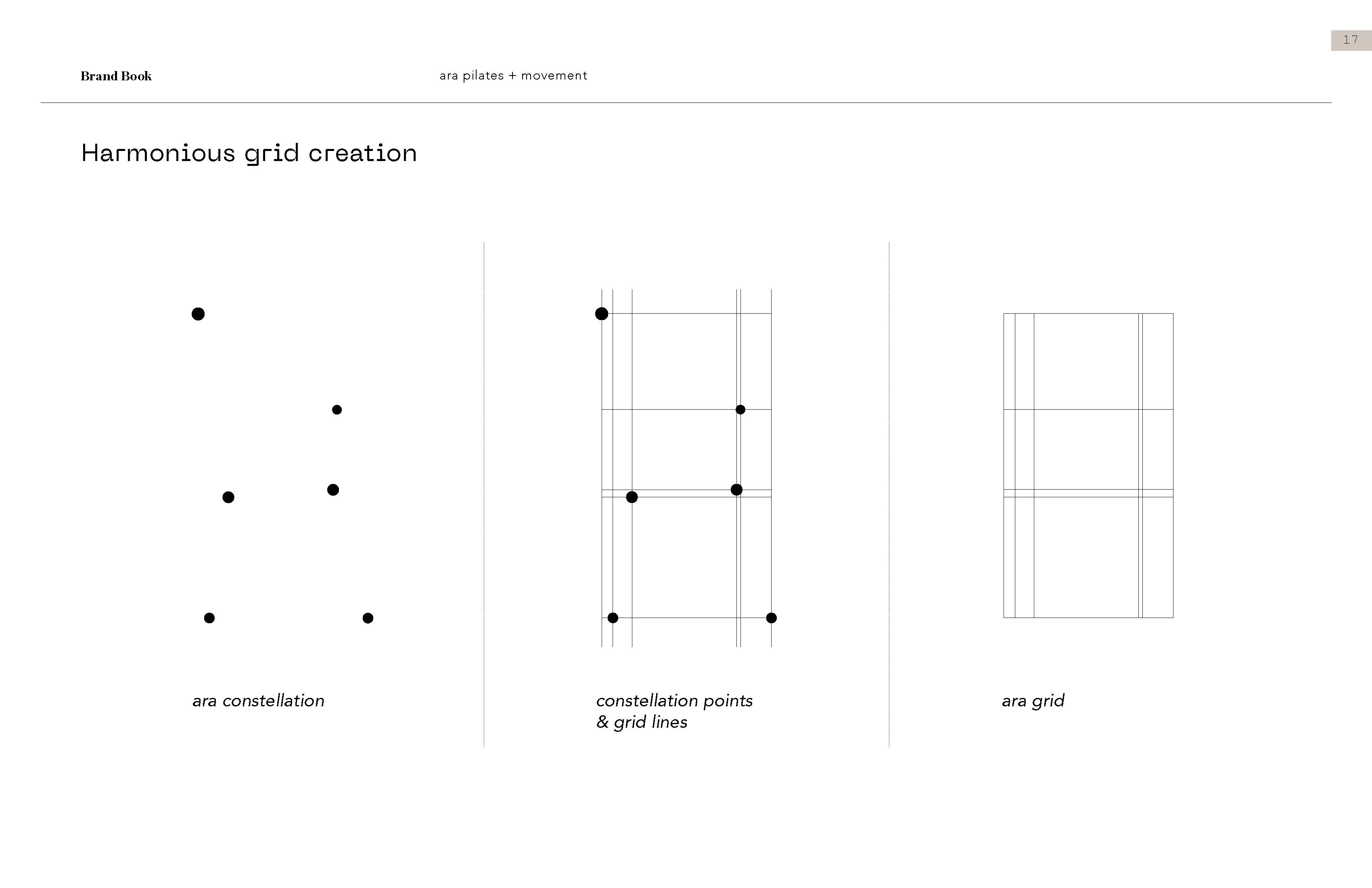
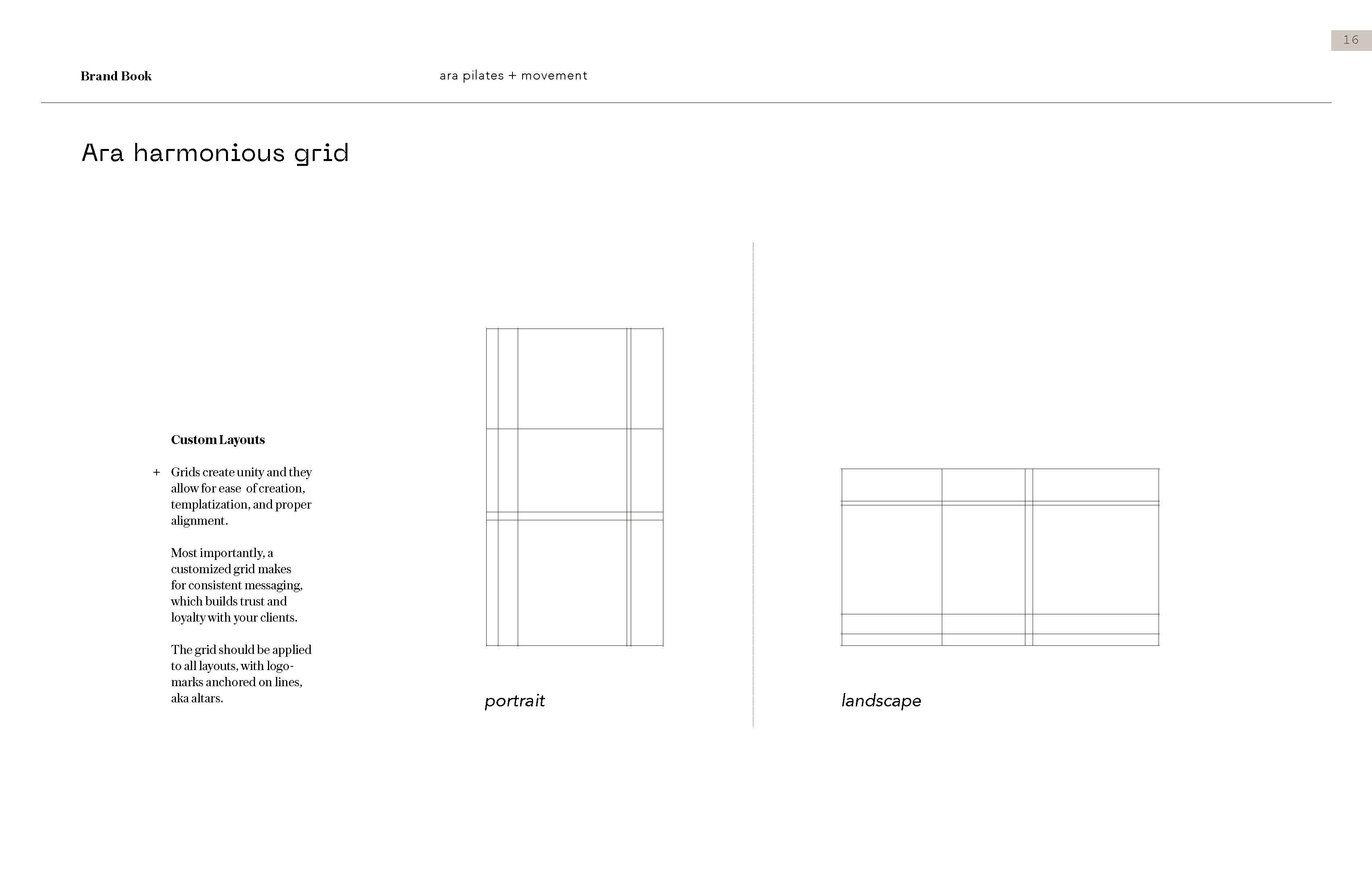
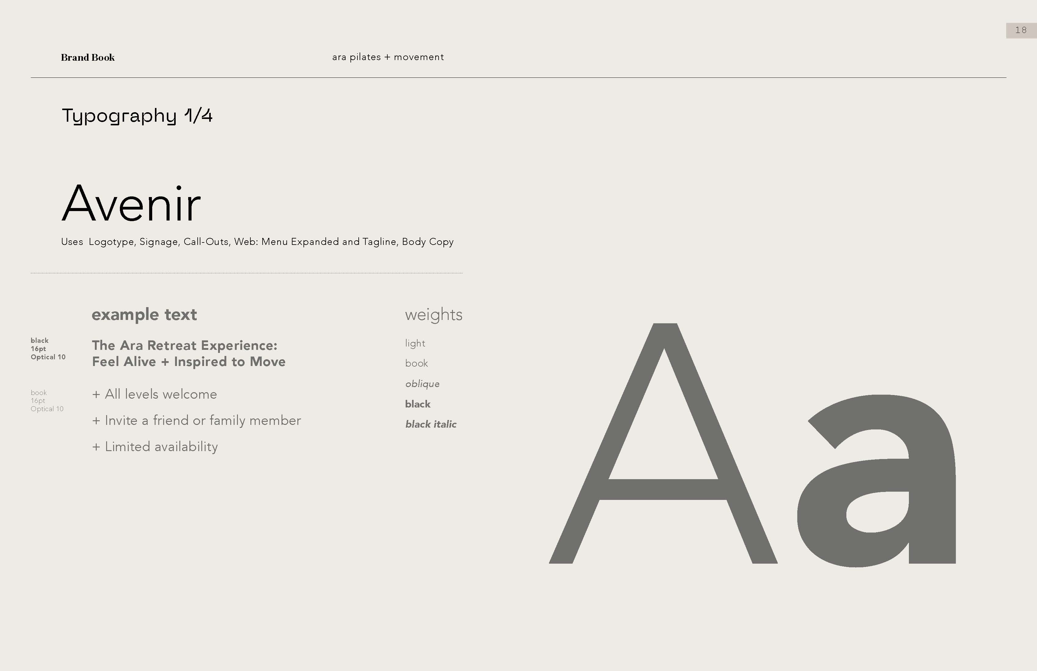
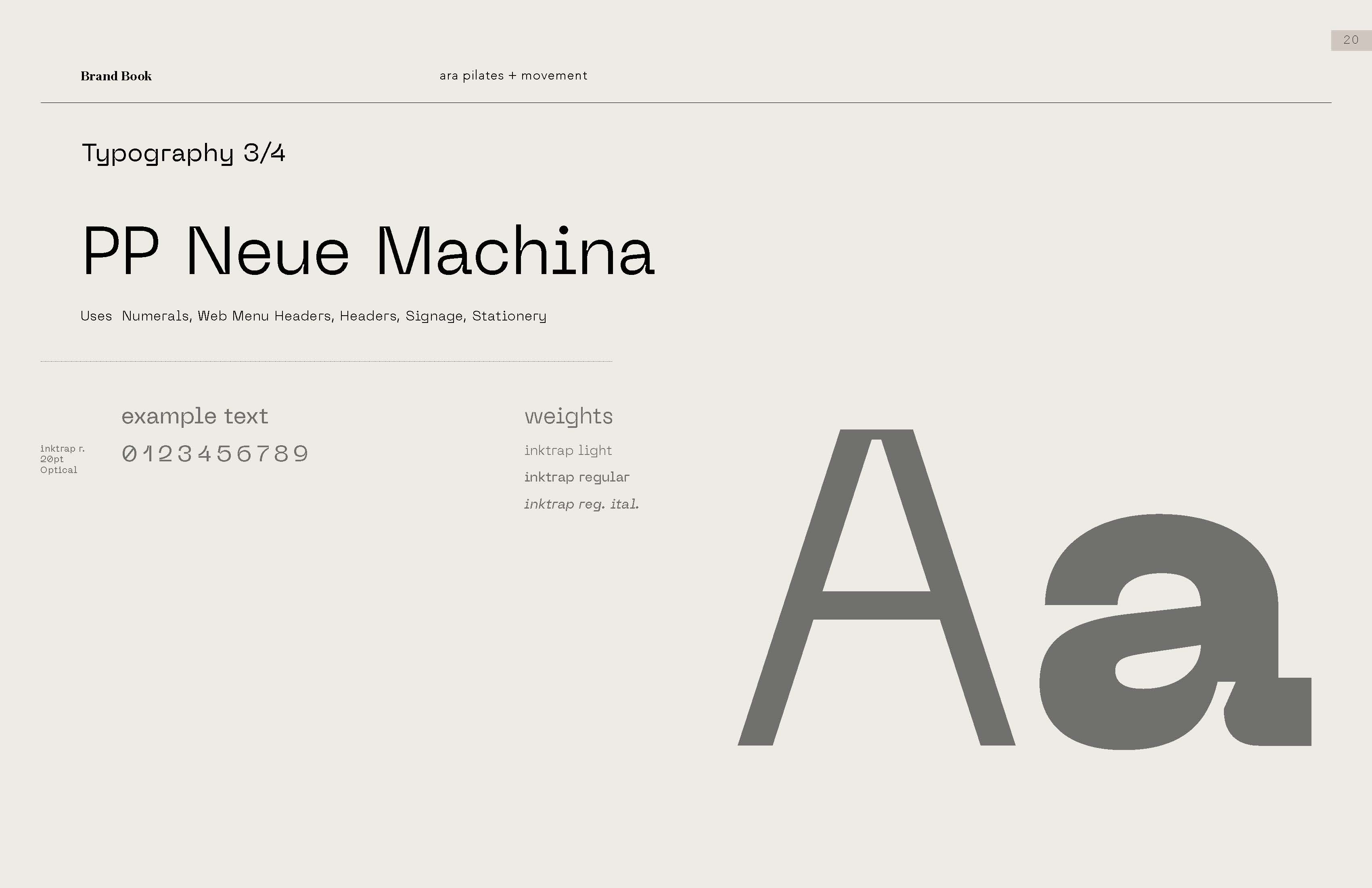
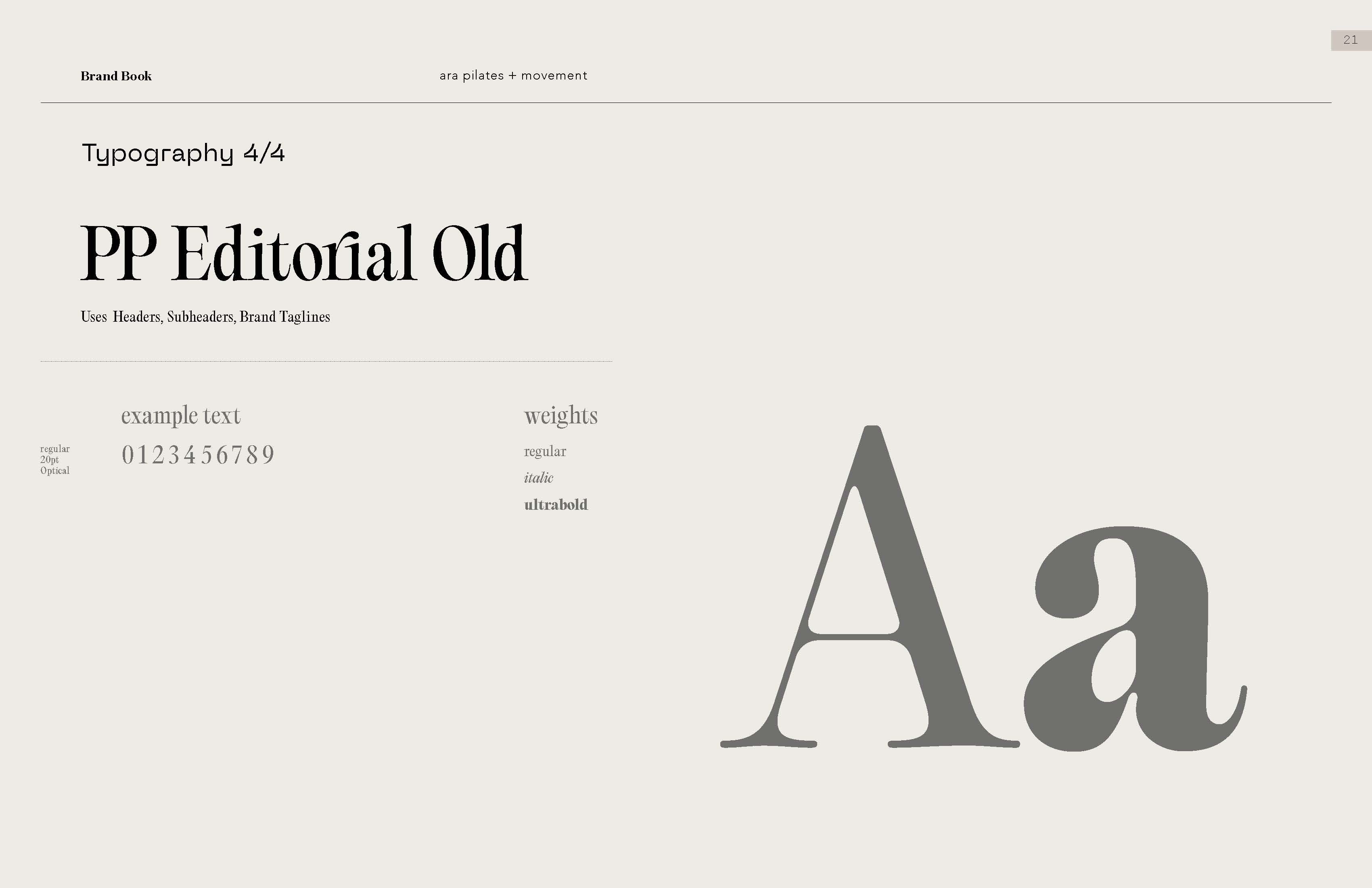
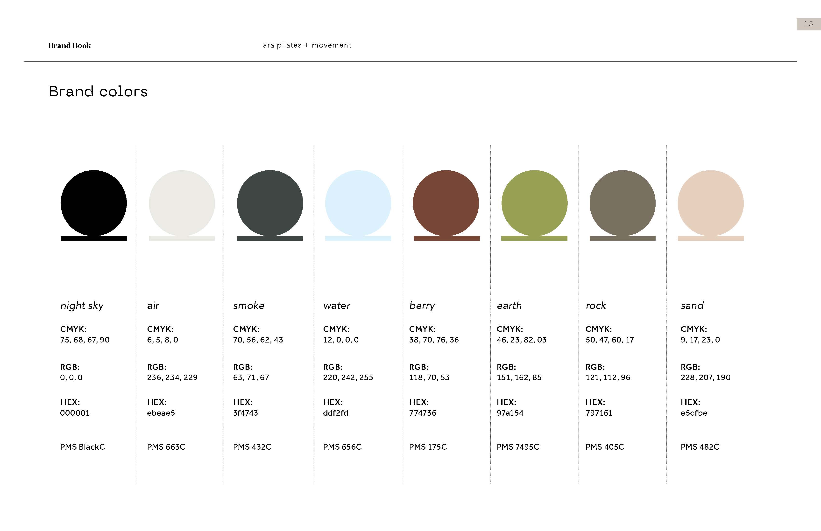
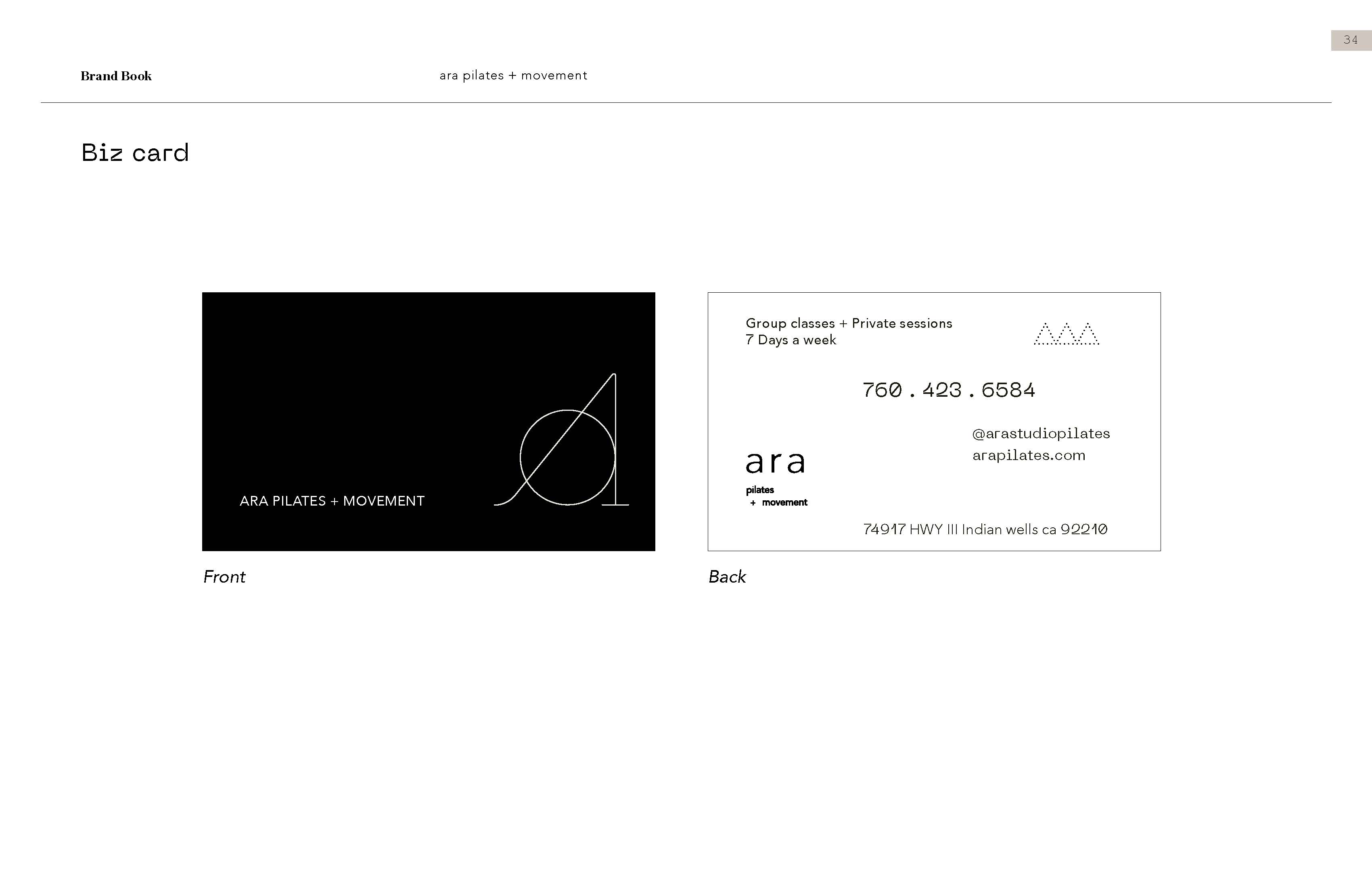
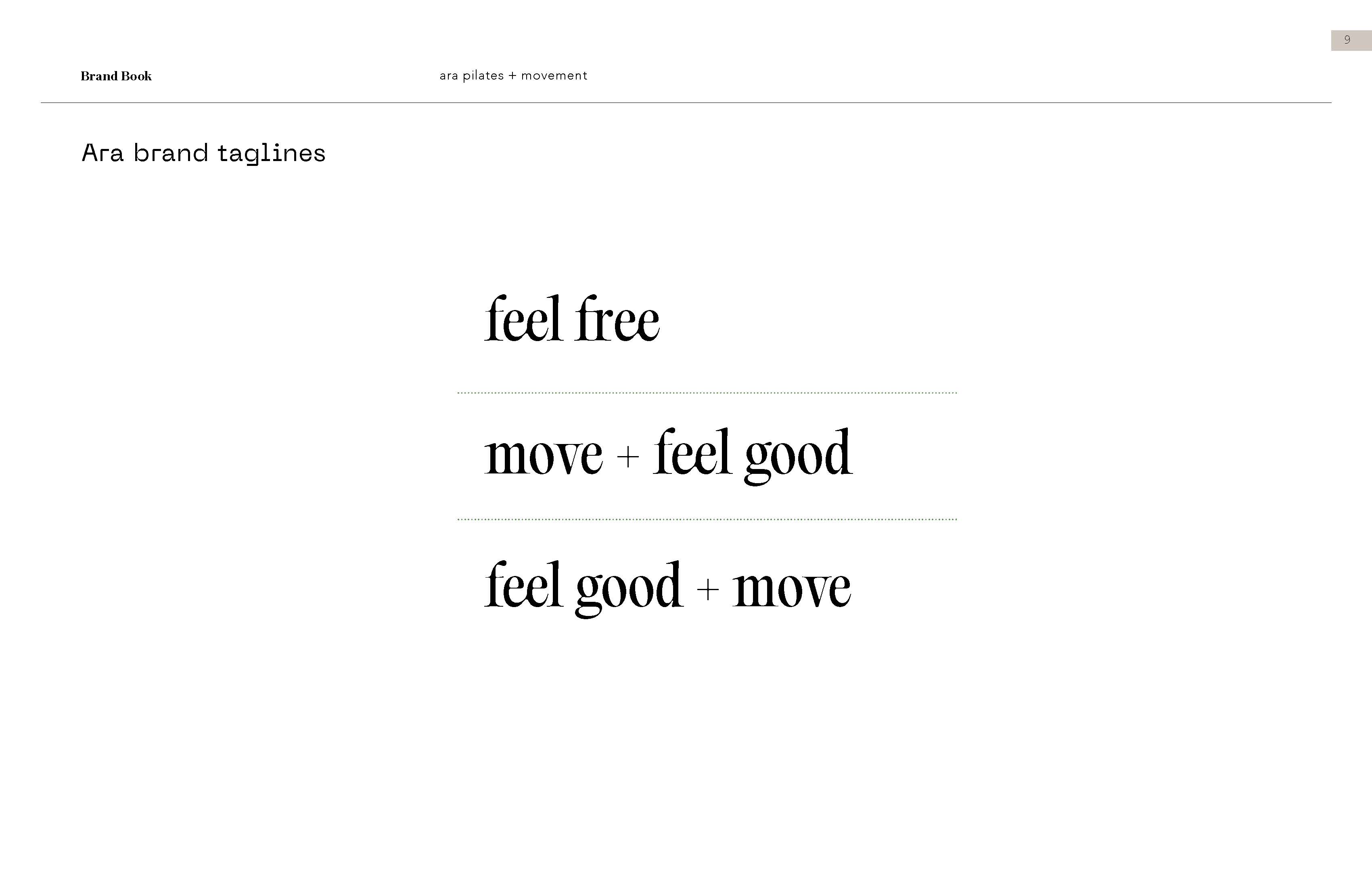
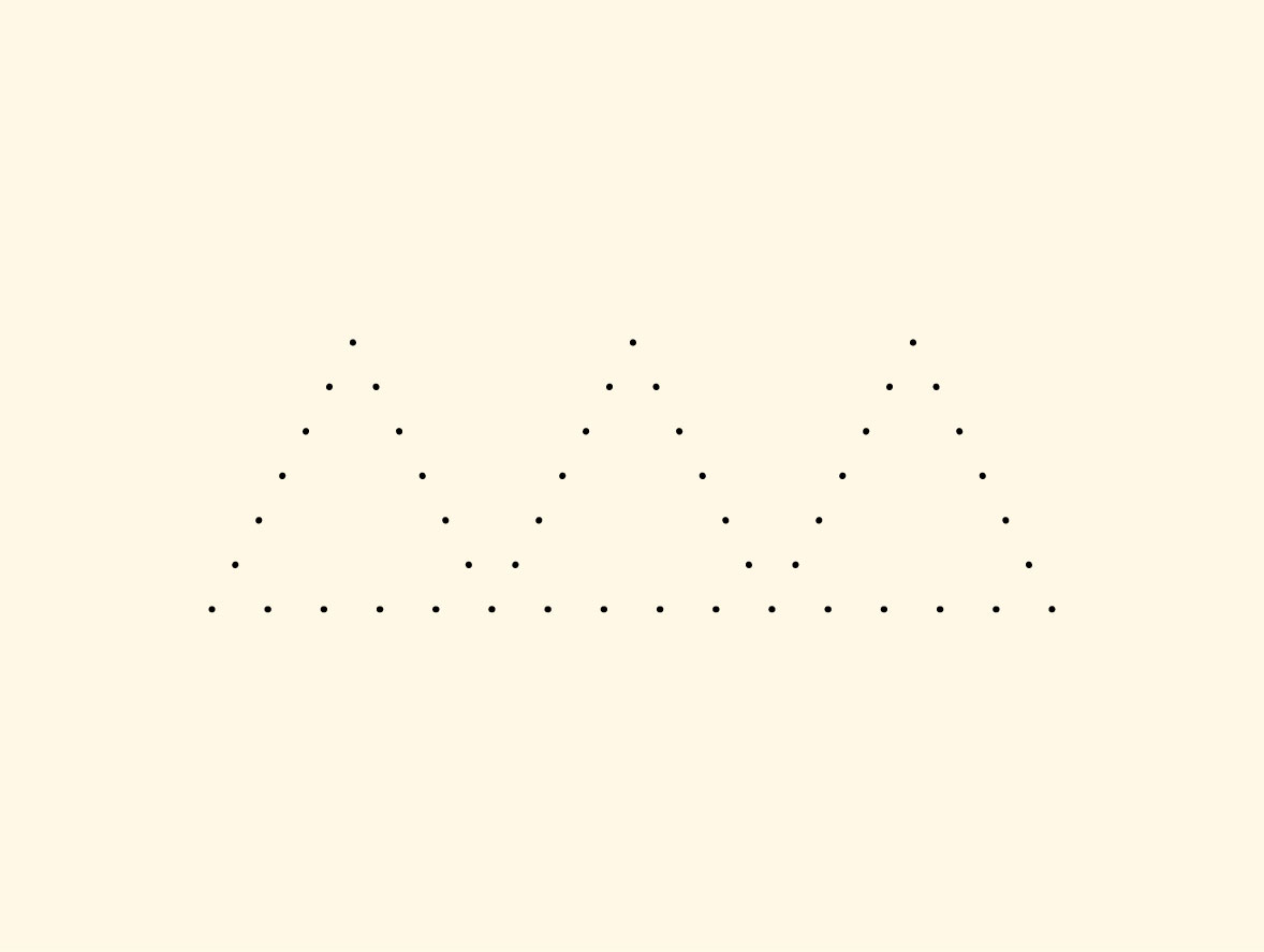
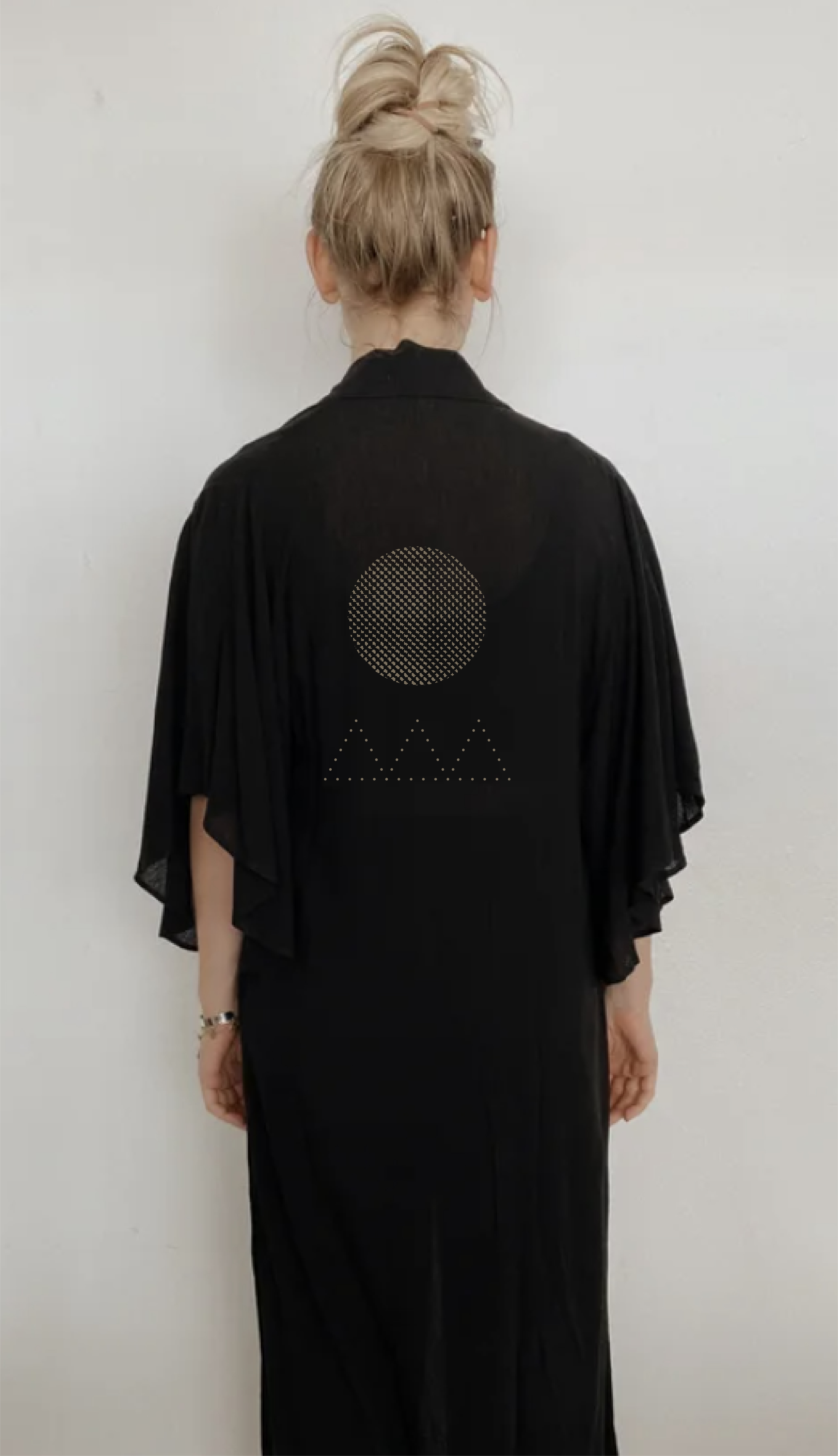
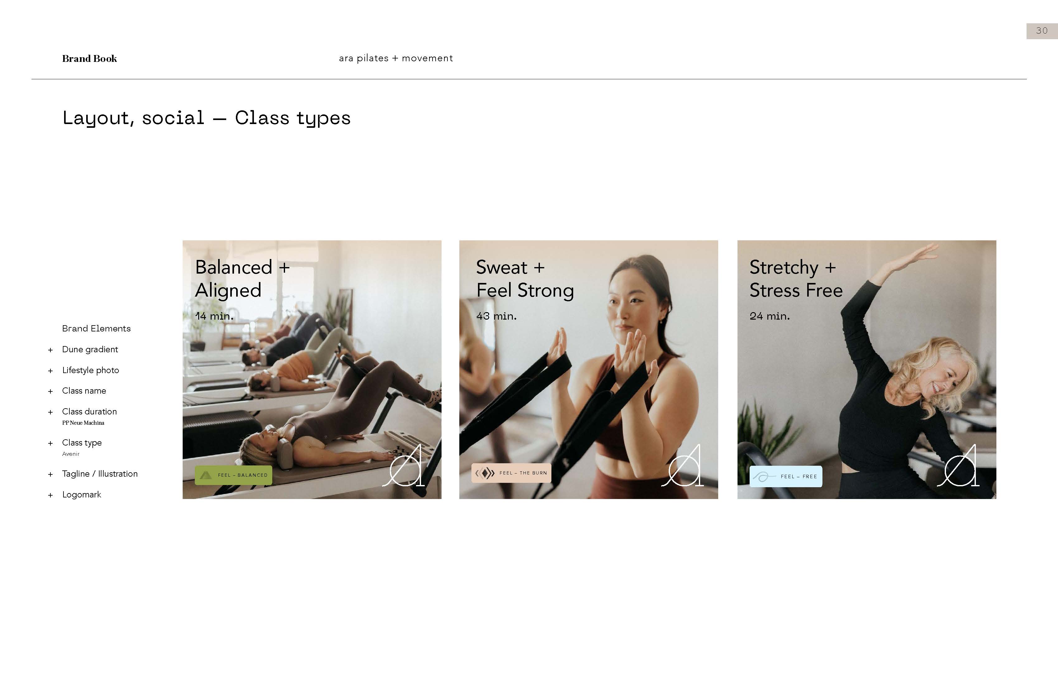
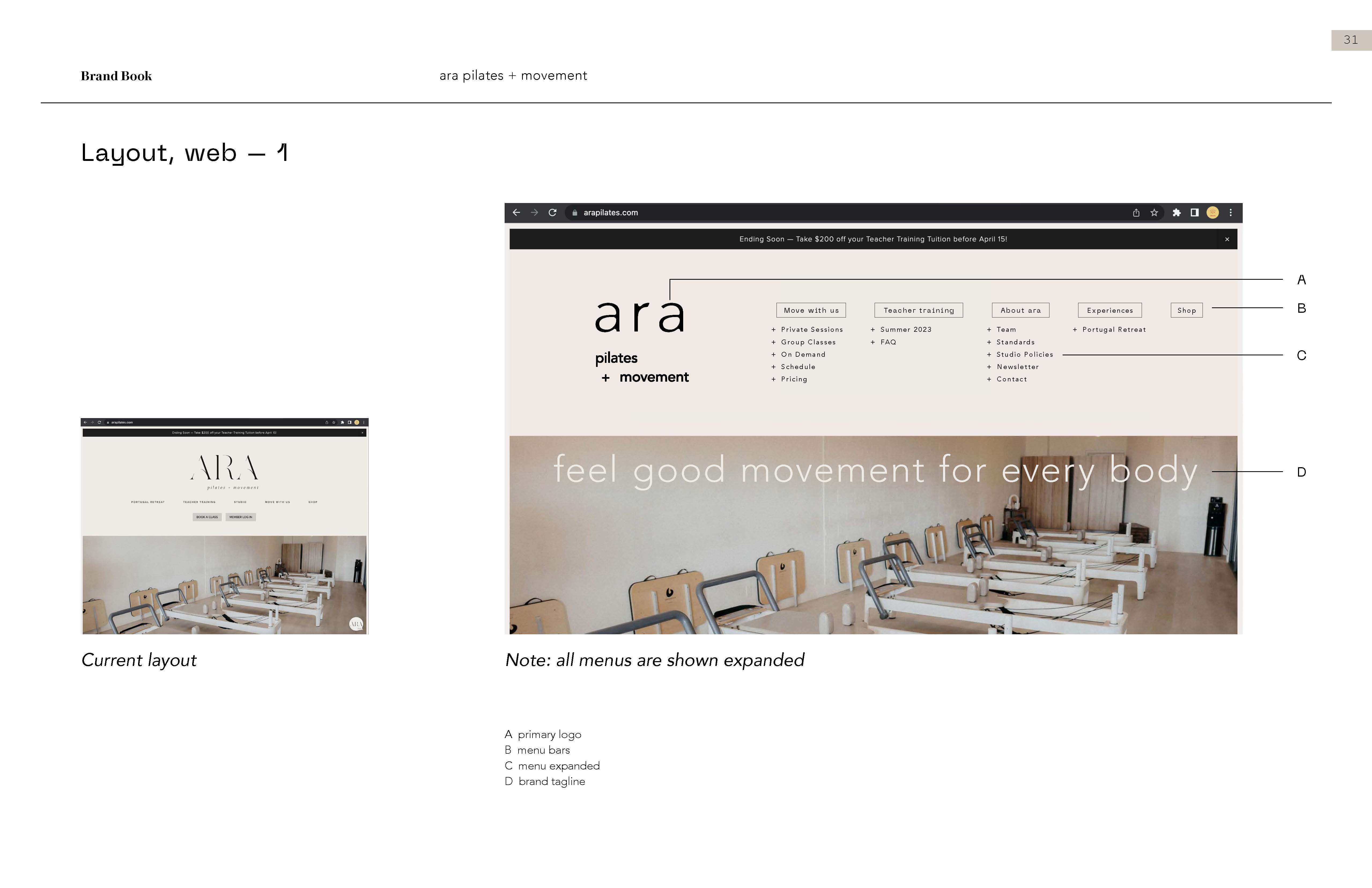
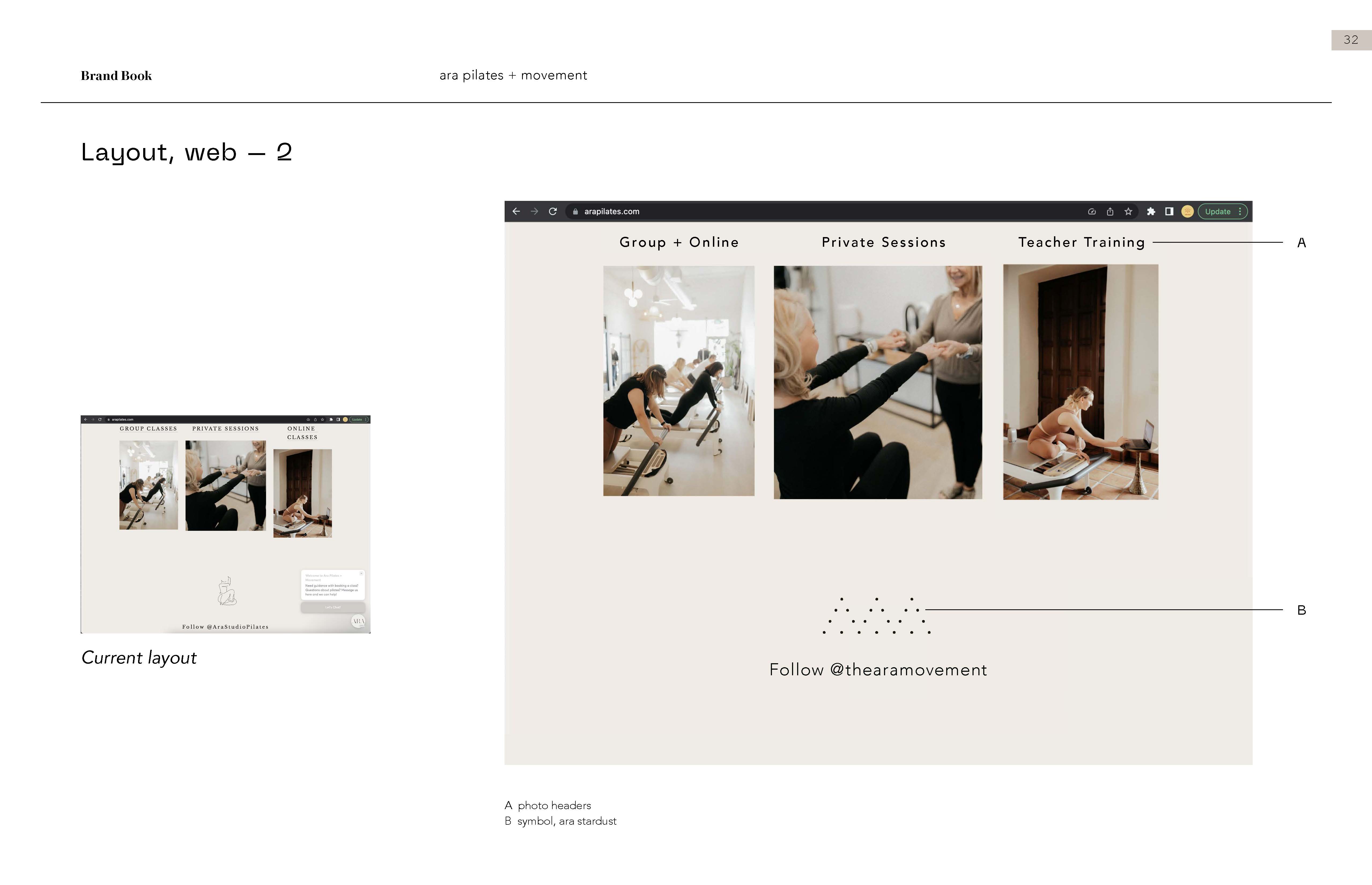
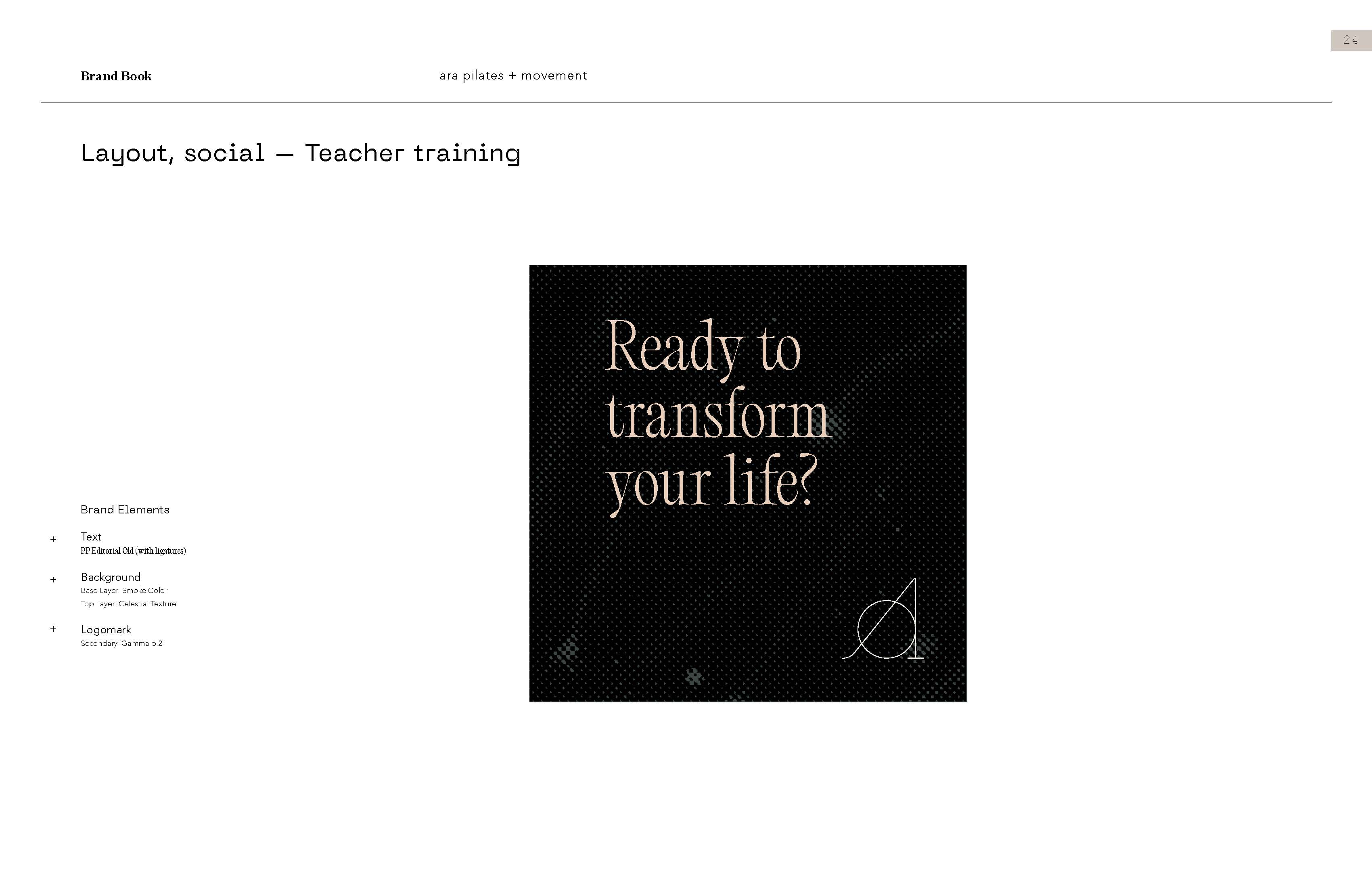
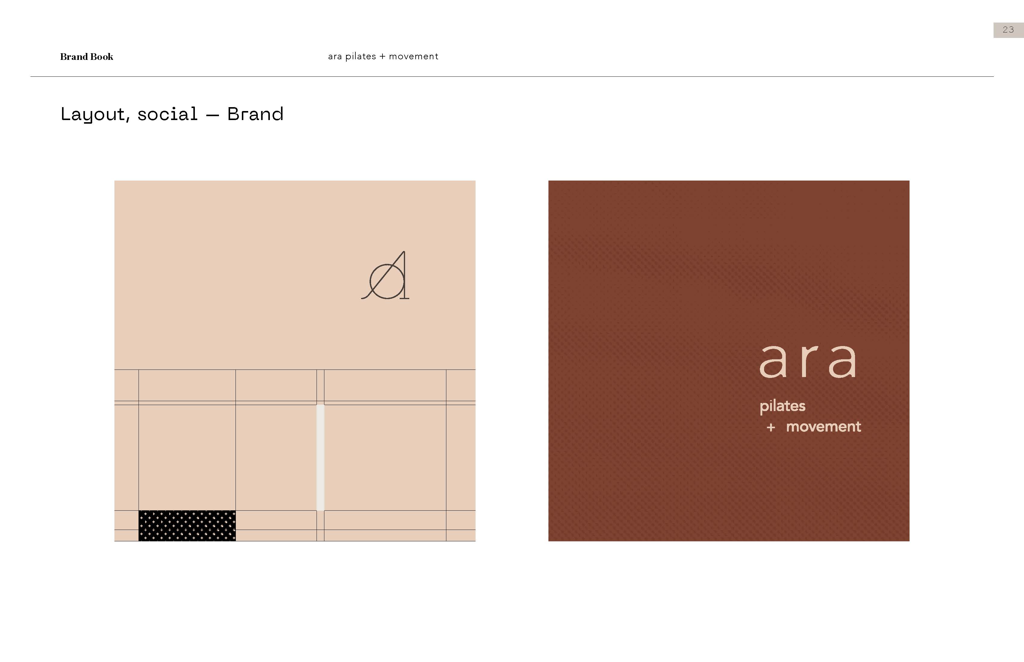
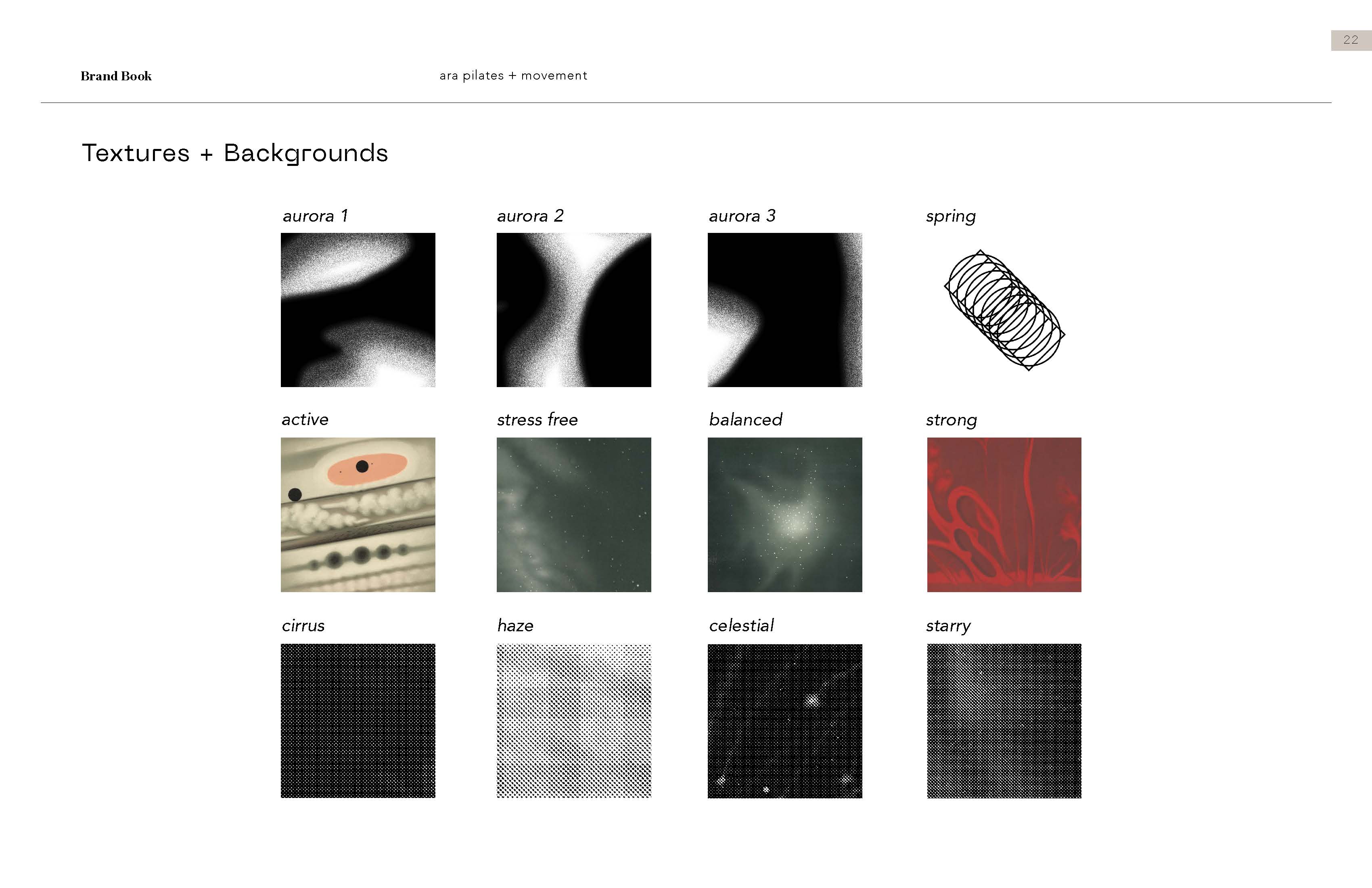
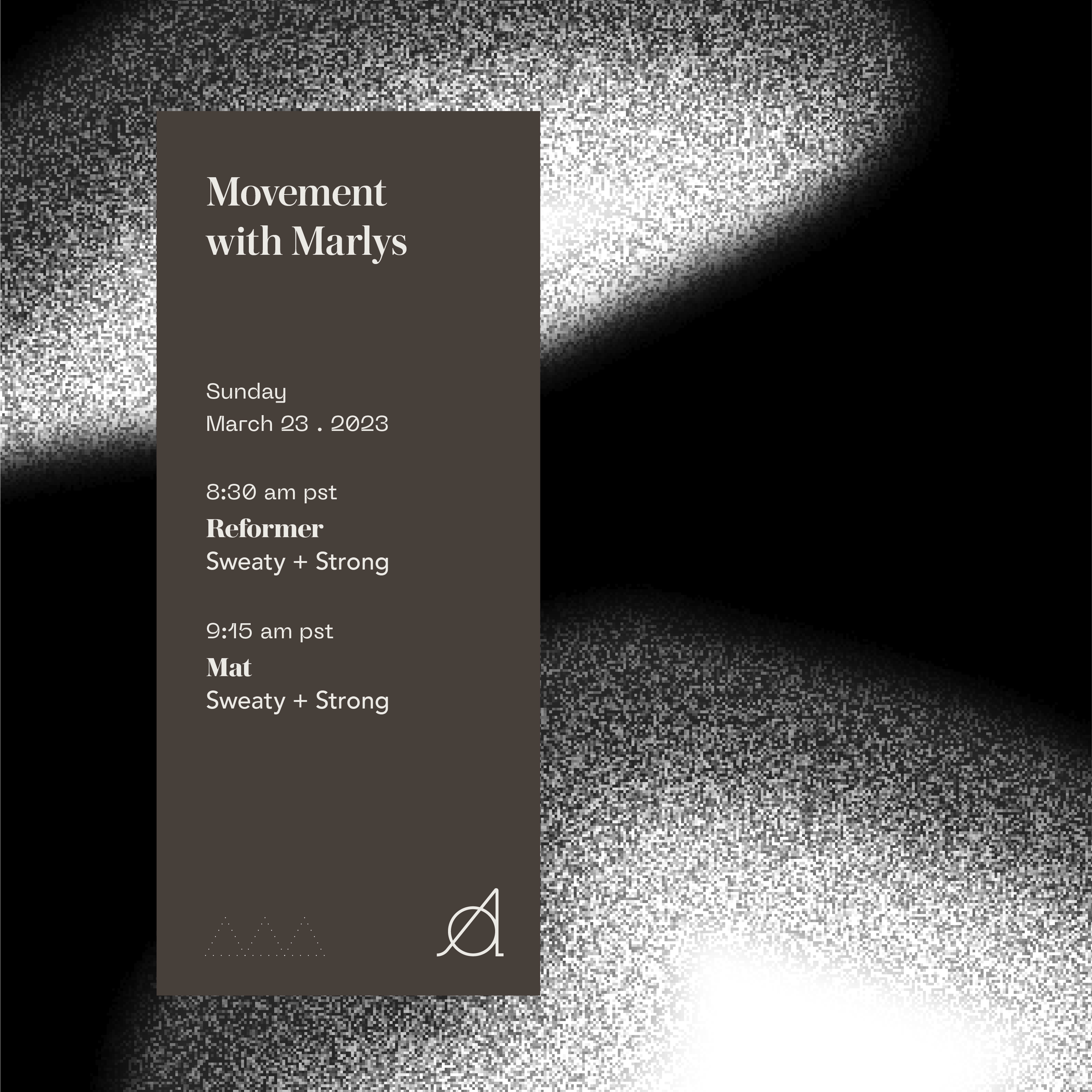
We started with strategy, defining her target market, client preferences, and core design needs. From there, I developed new typefaces, a color palette, and a kit of parts built on a unique grid structure inspired by the Ara constellation. The palette (night sky, air, smoke, water, berry, earth, rock, and sand) borrows from the sky above and the desert below. Together the pieces give Ara a brand system that is flexible, cohesive, and distinctly its own.
Brand repositioning, Brand strategy & architecture, Branding, Web UIUX, Merch strategy
Client Ara Pilates
Location Indio, CA
Timeline 5 months
Year 2023